Ever seen your friends share informative posters with graphs and/or tables? If you love to read blogs or browse social media, you’ve probably seen a few of them here and there already.
These days, those educational visuals are called “infographics.” The word itself is a portmanteau of the words “information” and “graphic.” This simplicity reflects how infographics share knowledge in a condensed, visually engaging manner.
At their heart, infographics are all about simplifying and packaging facts into an easily digestible, shareable format. Attaching an infographic to a blog post increases the likelihood that people will share it with friends and family.
On Twitter alone, photo tweets are 94% more likely to be retweeted than purely text-based tweets. This makes infographics an indispensable brand marketing tool.
Before we discuss how to get the best out of them, let’s talk about why they work so well.
Infographics Get You Through
People’s appetite for visually condensed information stems from our brains’ preference for graphical instead of textual information.
The numbers don’t lie: our retention rate for visual information reaches 65%, a huge leap from a mere 10% for text-based content.
Our eyes and brains are getting blasted with much more information now more than ever. From the first ever website launched in 1991, we jumped to 29 million in 2001 and then to 346 million in 2011.
Currently, there are more than 960 million websites online. This creates a huge challenge for marketers who want to be heard through the huge clutter of online content.
The amazing thing is that this growth is poised to continue exponentially. By 2016, we’re expected to hit the one billion mark, with the worldwide global traffic to exceed 1 zettabytes per year.
To put that into perspective, 1 zettabyte is equivalent to 1 trillion gigabytes.
That’s 1 trillion gigabytes worth of information being shared in a year – more than 31 thousand gigabytes in a single second, worldwide.
Here’s where infographics can help you cut through the mix. Use them to grab attention for your social media campaigns and improve your chances of reaching your audiences.
Get the Best by Going Back to the Basics
Infographics are undoubtedly useful, but the question remains: how do you make them consistently effective and, most of all, stunning?
This is where we start talking about the fundamentals of design.
Recalling the basics refocuses and refreshes your mind, helping you identify what makes a good layout and avoid common infographic design mistakes. Applied correctly, it provides a useful framework for making eye-catching visuals.
Here are six ways these building blocks can create slick and gorgeous infographics:
1. Emphasis
Emphasis puts more focus on the key parts of your infographic. It’s related the concept of hierarchy in design, which orders your elements from most important to least important.
Depending on where you place an element and how big you make it, effective use of hierarchy shows viewers what they should look at first. For instance, titles and headings tend to be the biggest element in most posters.
With any layout, it’s imperative to set an order of emphasized and subordinate elements based on your main points and supporting data.
This is especially important for infographics with a ton of information packed in. The more text your viewer has to take in, the more you should use emphasis as a signpost to differentiate significant from insignificant information.
To determine your hierarchy, list down all the elements required for your infographic. This includes everything from the text, shapes, logos, headers, and footers. Rank these parts in order of their significance, and your resulting list should help you choose what parts to emphasize.
In this example below, both the overwhelming size of the main text, and the use of the color red in a mostly unsaturated layout emphasizes the headline.

It’s important to remember that emphasis depends on the relationship between the different elements. Emphasizing everything emphasizes nothing at all.
2. Contrast
Contrast relies on how easily your viewer can tell two or more elements apart (McNeil, 2008, 12).
Closely tied with emphasis, it can chiefly be controlled by manipulating the size and color of the objects in your layout, to assist in emphasizing and subordinating them.
Infographics with strong contrast have distinctive and clearly defined elements. The title, main points, supporting text, and call-to-action are easily recognizable and distinguished from one another. With weak contrast, they seem blended together, with no clear element standing out.
As an extreme example, a red-colored logo placed on an orange background would be hard to make out. Putting it on a green background (green being a complementary color to red) would make it stand out better.
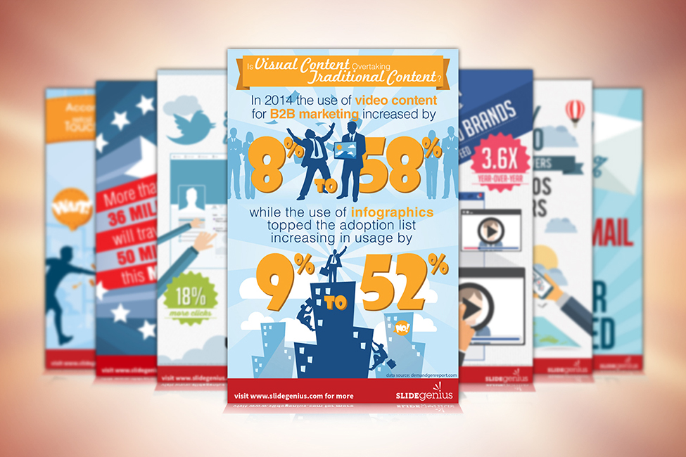
In this example below, we used a complementary color scheme of blue and orange to make the main image and statistic contrast with the background and supporting text.

Having optimal visual contrast makes for a striking design. By differentiating and highlighting your vital elements from the rest of the page, it suggests variety, affects visual style, and avoids staleness.
3. Balance
Balance is linked with distributing visual elements in your infographic, relating to the concept of visual weight.
In the real world, our understanding of weight is how hard gravity pulls on an object – how heavy it is.
But when we’re working with a two-dimensional plane, we translate this same logic by judging elements by traits like size, color, position, and orientation.
A design is off-balance when too many elements are concentrated on one part of the layout. For instance, if you placed all of them in the lower half of your design, you’ll be leaving a lot of unnecessary white space in the upper half, while making it harder to discern the individual parts below.
In the following example, we see the three statistics and their accompanying elements equally spaced along a horizontal plane. Other than preserving a sense of symmetry to the screen, it also makes it easier to go from the left-most statistic to the right-most.

Having a balanced layout keeps eyes glued to screens because it keeps audiences from wondering how exactly they’re supposed to start reading your infographic, and what part to go to next.
4. Alignment
Alignment refers to how the elements’ arrangement match up with natural lines and borders that are invisible to the viewer.
In simple terms, our eyes perceive unity from seeing things lined up with each other.
This is commonly achieved by placing objects in the space of a defined grid. Designers usually divide their layout into thirds before beginning the layout, though other means of dividing the page may also work.
Working within a mostly invisible grid system imparts a subtle yet important sense of visual harmony into your infographic.
Putting this to work is simpler than it sounds. You can see this in newspapers and magazines, when the tops of two columns match up with each other or when the width of an image corresponds with the body text.
In the next example, notice how the height of the statistic matches the height of the text on the right. Both of them consequently align with the width of the top banner element. The fact that all of them match up suggests that a great deal of thought was put into the placement and adds sophistication to the layout.

They may sound like easy and obvious examples, but there are more sophisticated ways to both use and subvert alignment in order to achieve visual unity for your infographic.
5. Repetition
Repetition deals with how visual elements are used more than once throughout a design.
You can achieve this in a handful of ways. Simple examples of repetition include the following: of color, shape, line, or placement.
This can also work for an infographic series by having elements put in familiar places, making it easier to understand information with a quick glance.
For example, in a long and info-packed infographic, you can facilitate comprehension by consistently putting statistical information on the left side of the layout, while placing explanations and facts on the right side.
Doing this primes viewers to expect similar elements in the same places – lessening the chances that they’ll have to look for them in the first place.
In the following example, there are a lot of repeating elements that order the layout. Specifically, the repeating pattern of the statistics on the white bands and the supporting text on the red band assists the reader in differentiating and highlighting the statistics from the statement.

You can also support recognition of your brand using features among your different works such as a common color scheme, identical illustrations, similar design motifs, and shared themes. This makes it easier to see that your infographics share the same creator.
6. Flow
Flow is the path your user’s eyes take through your infographic. This will depend on how you put together the previous elements.
Typically, a person’s eyes will go from left to right and top to bottom when scanning a page or screen (McNeil, 2008, 27). This is natural for most viewers, and putting your elements in this common path makes your infographic more fluid.
Since flow can be described as a strategic blending of the previous five fundamentals, it also has a tendency to be easily overlooked.
A good guide question to confirm ideal flow is, “Is there a logical order to the path that my eyes are taking?”
You can easily answer this by taking a good long look at your design. After everything has been laid out and placed, take a step back and imagine you’re viewing your layout for the first time. Take note of where your eyes are drawn, and if they’re getting attracted to the right places.
Are you comfortable looking at it for a long period?
Are you seeing all the parts clearly?
Is your main message easily understandable?
Are the supporting data and statements overpowering visually reinforcing your point?
If the answer to these basic questions is yes, then your infographic has good flow.
In this last example, the repeating posters, as well as the gaze of the human figure directs attention towards the big statistic at the upper right corner. The absence of discernable elements on the lower left quadrant then redirects the view towards the statement below the number.

Ensuring your design is as fluid as possible eases communication. Flow guides viewers’ eyes, instead of causing them to bounce around a layout, and is a crucial requirement for an overall cohesive look.
Summing It Up: Infographics Work Well, If Done Well
Infographics are dominating the realm of social shares with their effective visual and textual communication potential and appeal. They are easy to understand and at the same time are fun to share.
If made the right way, they even encourage sharing among users – further increasing exposure
By taking only the most pertinent bits of data on a specific topic and presenting it in a visual manner, infographics prove to be best at spreading information and encouraging viewers to pass it on. This can have untold benefits for you and your brand by giving the legs to spread your message farther and faster.
With the right use of emphasis, contrast, balance, alignment, repetition, and flow, you can make yours stand out from the rest, and highlight your company and brand in the face of stiff competition.
The building blocks of design can make for great marketing foundations for your company.
Now’s the best time cash in on the trend yourself.
Infographics aren’t just great to look at. They’re amazing at communicating your brand to possibly millions, if not billions, of online users – users who may just fuel your next big break.
References
“Infographic Design and Marketing | SearchRank.” SearchRank, n.d. Accessed June 25, 2015. https://www.searchrank.com/services/infographic-design/.
“Total Number of Websites.” Internet Live Stats, n.d. Accessed June 24, 2015. http://www.internetlivestats.com/total-number-of-websites/.
Bradley, Steven. “Design Principles: Visual Weight And Direction.” Smashing Magazine. December 12, 2014. Accessed June 25, 2015. http://www.smashingmagazine.com/2014/12/12/design-principles-visual-weight-direction/.
Enge, Eric et al. The Art of SEO. Sebastopol, CA: O’Reilly, 2010.
Graham, Lisa. Basics of Design: Layout and Typography for Beginners. Albany, N.Y.: Delmar, 2002.
McNeil, Patrick. The Web Designer’s Idea Book: The Ultimate Guide to Themes, Trends, and Styles in Website Design. Cincinnati, Ohio: HOW Books, 2008.

Rick Enrico is the CEO and Founder of SlideGenius, Inc., a global presentation design agency. He regularly publishes expert presentation tips on the SlideGenius blog. He currently oversees an experienced team of designers, software developers, and marketing professionals that specialize in creating custom corporate presentations and cloud publishing applications.


